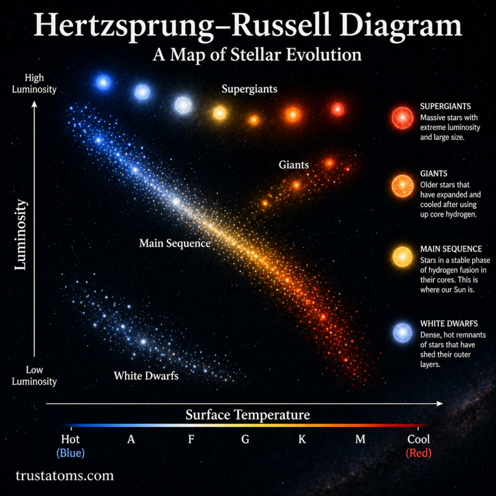
The Hertzsprung–Russell diagram (H–R diagram) is one of the most important tools in astronomy. It allows scientists to classify stars and understand how they evolve over time by comparing their brightness and temperature.
At first glance, it may look like a simple graph—but it reveals the entire life story of stars.
What Is the Hertzsprung–Russell Diagram?
The H–R diagram is a graph that plots stars based on two key properties:
- Luminosity (or absolute magnitude) – how bright a star truly is
- Surface temperature (or spectral type) – how hot the star is
Axes of the Diagram
- Vertical Axis (Y-axis): Luminosity
- Brighter stars are higher
- Dimmer stars are lower
- Horizontal Axis (X-axis): Temperature
- Hotter stars are on the left
- Cooler stars are on the right
This layout may feel reversed compared to typical graphs, but it reflects how astronomers traditionally organize stellar data.
Key Regions of the H–R Diagram
When stars are plotted on the diagram, they naturally group into distinct regions.
Main Sequence
The main sequence is the diagonal band running from the top left to the bottom right.
- Contains about 90% of all stars
- Stars are fusing hydrogen into helium
- Includes stars like the Sun
Characteristics
- Hot, bright stars: upper left
- Cool, dim stars: lower right
- A star’s position depends mainly on its mass
Giants and Supergiants
Above the main sequence are the giant and supergiant stars.
- Very luminous
- Large in size
- Often cooler on the surface than main sequence stars
Examples
- Red giants
- Blue supergiants
These stars are in later stages of their evolution.
White Dwarfs
Located in the lower left of the diagram, white dwarfs are:
- Very hot
- Very small
- Low in luminosity
They are the remnants of stars that have exhausted their fuel.
How Stars Move on the H–R Diagram
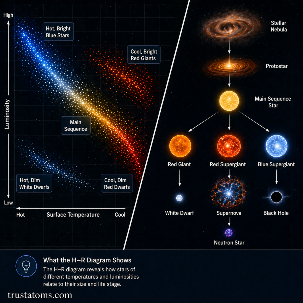
Stars do not stay in one place on the diagram forever. Their position changes as they evolve.
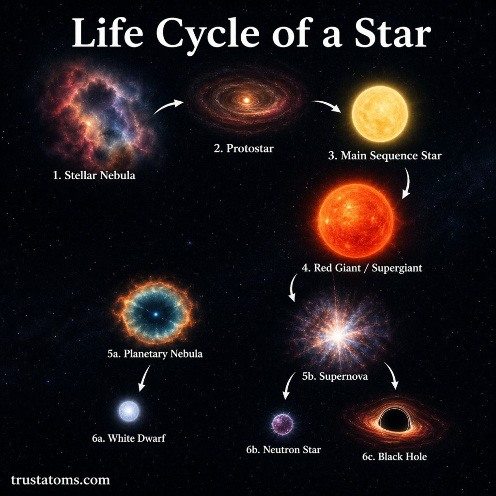
Stellar Evolution Path
- Protostar Stage
- Not yet on the main sequence
- Main Sequence Phase
- Stable hydrogen fusion
- Longest stage of a star’s life
- Red Giant Phase
- Expansion and cooling of outer layers
- Final Stages
- White dwarf, neutron star, or black hole (depending on mass)
Tracking this movement helps astronomers understand the life cycles of stars.
Temperature and Color Relationship
A star’s temperature determines its color, which is reflected on the H–R diagram.
Color and Temperature
- Blue stars: hottest
- White stars: very hot
- Yellow stars: moderate temperature (like the Sun)
- Red stars: coolest
This is why hot stars appear on the left side of the diagram and cooler ones on the right.
Luminosity and Size Connection
Luminosity is not just about temperature—it also depends on a star’s size.
Key Insight
- Large stars can be very bright even if they are cool
- Small stars can be dim even if they are hot
This explains why:
- Giants appear in the upper right (bright but cooler)
- White dwarfs appear in the lower left (hot but dim)
Why the H–R Diagram Is Important
The H–R diagram is essential for understanding stars and the universe.
Key Uses
- Classifying stars by type and stage
- Studying stellar evolution
- Comparing star populations in clusters
- Estimating ages of star groups
- Understanding the structure of galaxies
It provides a visual framework that connects many aspects of astrophysics.
Star Clusters and the H–R Diagram
Astronomers often use the H–R diagram to study star clusters.
Why Clusters Are Useful
- All stars formed at roughly the same time
- Differences are mainly due to mass
- Makes evolutionary patterns easier to identify
By plotting a cluster’s stars, scientists can estimate its age based on where stars leave the main sequence.
The Main Sequence Turnoff Point
One important feature in cluster studies is the turnoff point.
What It Indicates
- The point where stars begin leaving the main sequence
- Helps determine the cluster’s age
- Higher turnoff = younger cluster
- Lower turnoff = older cluster
This is one of the most powerful tools for dating star systems.
Final Thoughts
The Hertzsprung–Russell diagram is more than just a chart—it’s a roadmap of stellar life. By plotting luminosity against temperature, astronomers can uncover how stars are born, live, and eventually die.
From the steady glow of main sequence stars to the dramatic changes of giants and stellar remnants, the H–R diagram ties together the entire story of stars in one powerful visual framework.